


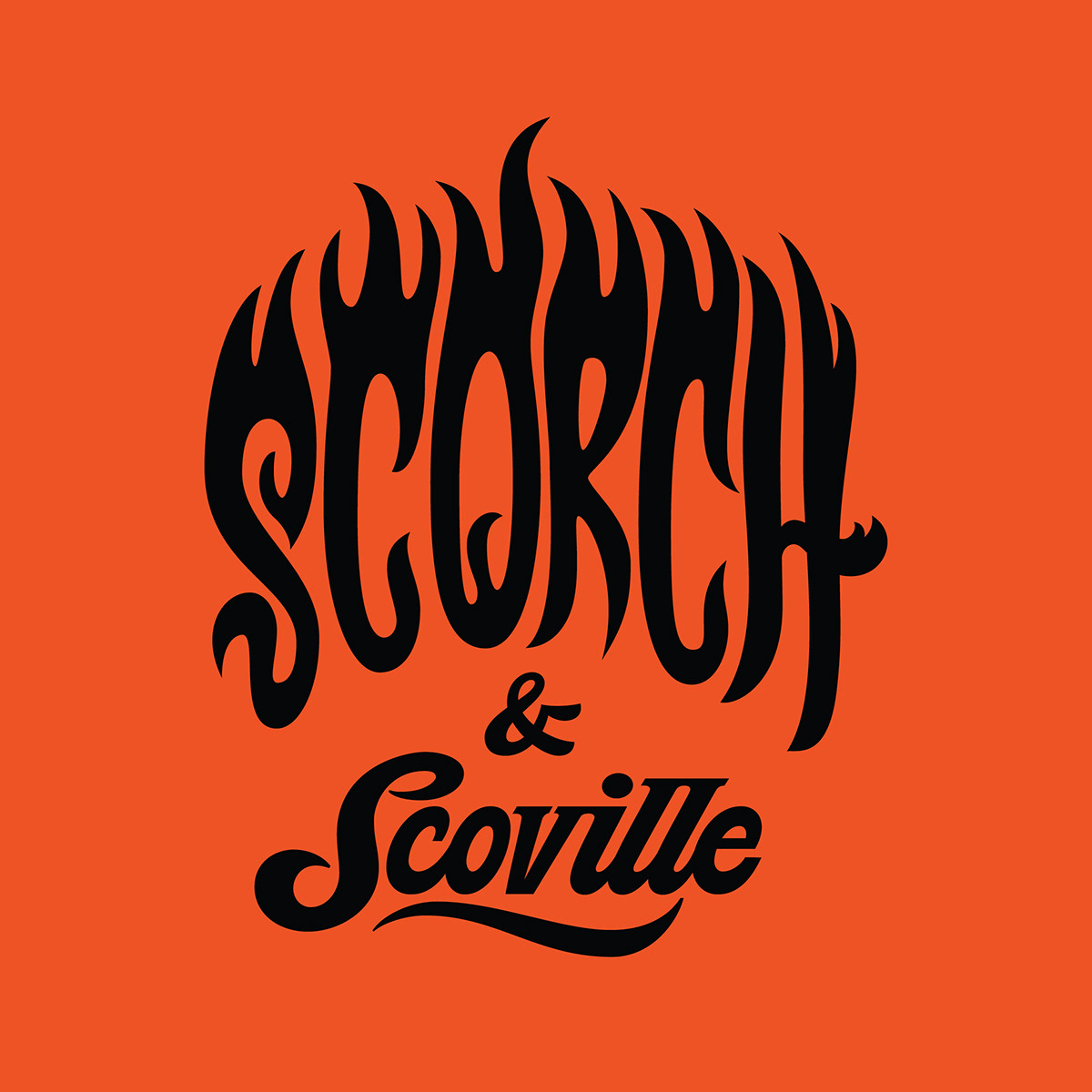
Scorch & Scoville Hot Sauce - Logo, Label & Branding
I love working with local businesses. When owners of Scorch & Scoville came to me with their fiery venture and passion for all things spicy, I knew this was going to be fun to work on! AND these folks are in my own backyard, York PA!
The vision of the brand was to create a logo and illustration that embodies the perfect fusion of taste and heat.
Drawing inspiration from the Scoville scale, a measurement of pepper heat, Scorch & Scoville aims to tantalize taste buds with an exquisite array of hot sauces that strike the ideal balance between bold, mouthwatering flavors and the exhilarating kick of heat.
My character illustration for the brand shows Scorch as a little minion character whispering in Scoville’s ear MAKE IT HOTTER! Scoville is known as a distinguished gentleman placing value on flavor and taste. The two personalities together craft the fine hot sauces of Scorch & Scoville.


Concept #1
This first concept during the creative process plays heavily off the dual personalities of the brand. Scorch is represented by a spastic cat that loves the heat, while Scoville is the calm kitten that focuses on flavors in the kitchen. The character design could be used as monotone colors on labels front and center with the logo below.


Concept #2
The second concept offers two characters that have contrasting personalities but together form a bond and perfect pairing. Best friends if you will. A playful representation of the flavor and fiery elements of the product. Harmonious together. Would be redrawn as a clean smooth vector illustration and be used as one or two colors on the label, t-shirt design etc.


Concept #3
The third concept is another take on the contrasting personalities of Scorch & Scoville. One is into cooking and flavor, the other fiery and hot! Art could remain sketchy with hand-drawn look, or become a smooth clean line art vector in fuller color palette.


Concept #4
This concept thinks outside the box and the character art shows its personalities and mood through the stop light. RED fiery hot! YELLOW mild and GREEN full of flavor. This design offers the connection of the contrasting flavors found within Scorch & Scoville. Lots of options for coloring.


As the creative concept was narrowed down, the art direction of the character focused on a dapper gentleman with a pet minion named Scorch who was full of firey ideas on how to make the hot sauce…hotter! Scoville keeps it centered and focuses on the flavor of the brand.
How fun are these doodles!? These concept sketches helped drive the final design and illustration for the Scorch & Scoville brand.
How fun are these doodles!? These concept sketches helped drive the final design and illustration for the Scorch & Scoville brand.

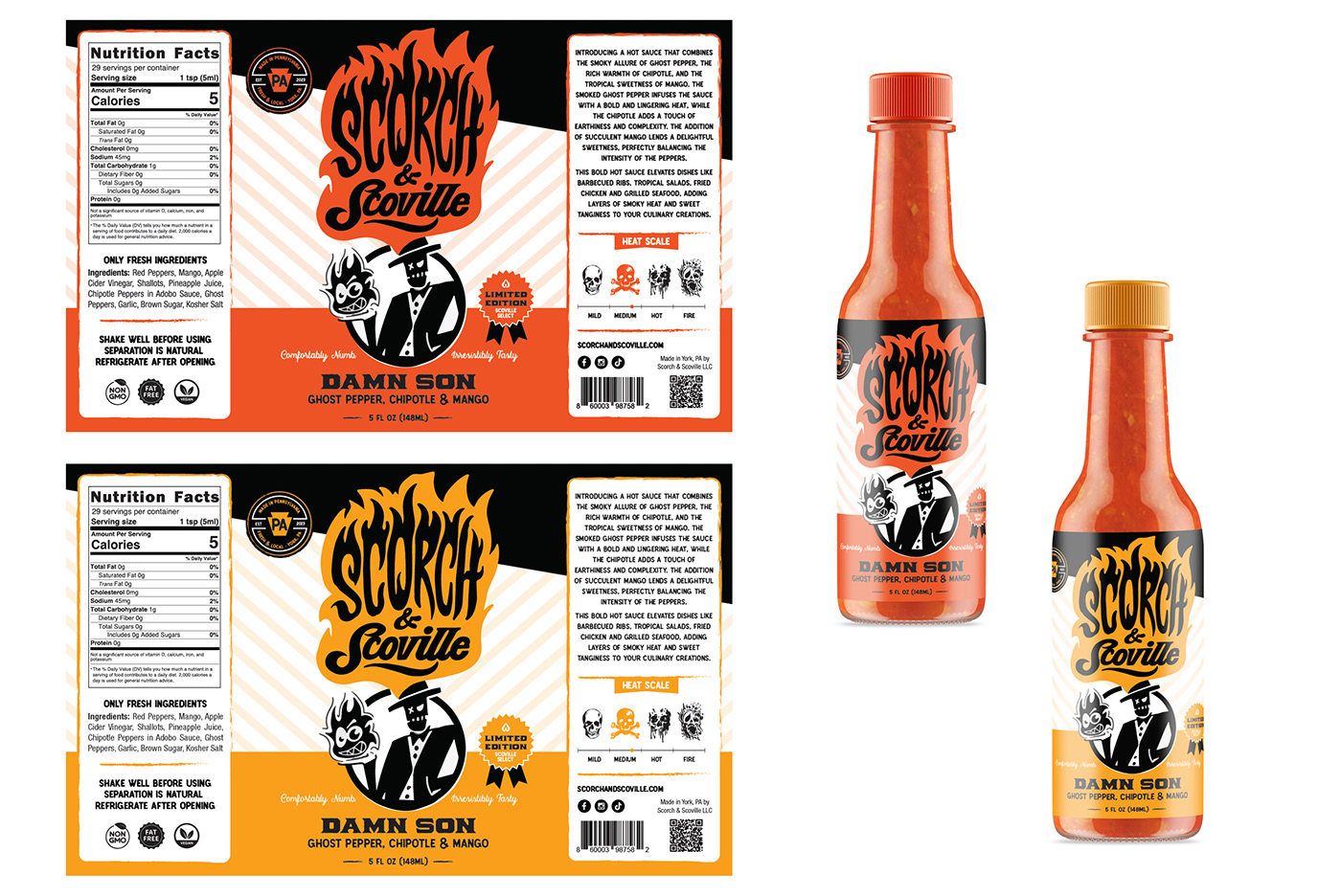
Next, the layout of the packaging and hot sauce label itself was explored. The graphic design concept allows for the color and name of the hot sauce graphics to change per SKU creating a functional branding template. This branding design brings unity to the set of labels as additional products are rolled out.


Thank you Jeremy Friend for collaborating on this project!! Love that lettering.


Hoot Design Studio
Illustration • Branding • Label & Packaging Design
www.hootdesignstudio.com | Follow along on Instagram
LET'S WORK TOGETHER
Email: Jen@hootdesignstudio.com


